Tuesday, 30 September 2008

World of Interiors


This magazine has got nothing to do with Graphic Design, but everything to do with 'design'. Try and pick up a copy - 'get to know' as they say.

Keith Skeel


I'm not totally sure why I've included this in my 'blog', but I feel this gentleman worthy of note.  The only way I can think of describing him is as an antique 'super-collector' and a purveyor of antiquarian eccentricities.  Having started from humble beginnings as a small time seller of 'funny things' at Bermondsy market in London, he has become a serious collector with a passion for beautiful, gutsy, dramatic and amusing things, a highly acclaimed 'interior decorator's decorator', and has done work for Donna Karen, Versace and Ralph Lauren.

I've been to his shop in London, and also went to the sale of his house and the totality of its contents in Suffolk (he also sold his house in New York, and all of its contents).  This was the first time he had ever sold any of his personal collection.  The shop is fantastic, but what was in the house was amazing.  Nothing was normal, everything had its own quirky idiosyncrasies, humour and wit (I think it is for this reason that I've included him). Antiques are, after all, 'sick' (in my opinion).

Julien LaChaussee - Photographer


I haven't got loads to say about this French homme, but I like the way he presents his subjects, and the sometimes conflicting content of his images.  Have a look at his website for more.

Monday, 29 September 2008

Oliviero Toscani


An Italian photographer and art director, who trained at the Dada and Bauhaus influenced Zurich Design School (I believe you can particularly see the Dada influence in his work).  He is notorious for his work with Benetton, with whom he abandoned any form of conventional advertising photography, and instead flouted taboos associated with race, war, sex, religion, death etc.  The campaigns use juxtaposition as the main tool to create meaning by using socially unmentionable subjects to create awareness of different issues, and virtually all created some sort of public outcry. 

The most infamous images included the dying David Kirby (of AIDS) and images of death-row prisoners, which due to the backlash from the victims families caused Benetton to lose a major contract, and Toscani to finish his tenure with the company. 

At least his campaigns kept everyone talking about Benetton, and he dared show the unmentionables.  What taboos are left...?


Nolita - Anti Anorexia Ad


This is an advert photographed by the scandalous photographer Oliviero Toscani (more on him later), for the fashion brand Nolita, and was shown in all Italian  cities and world media.  There is nothing shy about the image, with the fact that the model is shown fully naked only adding to the controversy and impact of the ad.  A (semi) clothed model just wouldn't have the same effect (obviously).

However, my problem with this ad is its target market - who is the ad aimed at? Anorexic people, people who are potential anorexic, or non anorexic people?  The reason I question this is because surely anorexic people don't mind what their bodies look like - they only care about being as skinny as possible, and therefore this arguably renders this ad ineffective (if that is the target market...).  Most potential anorexics would look to the poster and start comparing the unfortunate model to them - she would them become a 'body' target, someone they aspired to, rendering this ad ineffective.  It would therefore seem that this is aimed at those who aren't anorexic...

Gay Police Association Advert (2006ish)


This fairly provocative ad was welcomed by a barrage of complaints when it appeared in 2006.  Groups such as Christian Watch and the Evangelical Alliance claimed that the ad was 'derogatory, offensive and irresponsible by implying that Christians were responsible for most such homophobic incidences'.

The shock factor here is the combination of the images of blood and the bible (and the implication of violence), things that aren't usually linked.  The fact that blood is used implies that all of the incidences of homophobia are physically violent (as opposed to verbal, say), but I say why not, the ad was meant to shock, and there's no point in any half measures in this case.  The more complaints the better. 

Thursday, 25 September 2008

Alain De Botton - The Architecture of Happiness


This book flooded me with joy when I read it the first time. Everything he talks about provokes more philosophical questions which he is sure to discuss as you read on. He answered so many questions I had about so many things - the content here is obviously centered around architecture, but the opinions and ruses can be applied to so many other aspects of design. Well worth reading.

Jonathan Root - Photographer


Lovely composition, content, colour and with a delicate seasoning of abstract, great stuff. Have a look at his website.

Olu Amoda


A Nigerian artist/sculptor who has with his interesting take on things has transformed some of this societies security fears into art. Unfortunately at the moment I can't seem to find any pictures of the security gates (you can see some of them here though) he designs, but they are essentially artistic creations using found objects which fuse together apects of design and security. In a country where burgulary is rife, where every wall/door/window is guarded by barbed wire, broken glass or razor wire his 'doors of paradise and windows of dreams' (as he describes them) are a refreshing version of what is common.

Maggie Hambling - Scallops


This sculpture sits beautifully on the otherwise untouched stretch of beach in Aldeburgh, Suffolk, and is a monument to Benjamin Britten, the great British composer. Apart from looking spectacular, the main reason I like it is due the aggressive hatred that this sculpture instilled in locals. It was vandalised, there were handfulls of petitions against it etc etc etc - controversial!! Now it is an accepted part of the scenery, but no doubt there are still bitter people with a foul word to utter about it.

Exhibition Space in Nebra - Holzer Kobler Architects


The whole site ties in nicely together, and its elegant yet aggressive imposition on the landscape is interesting. The contrast of the materials used and the setting is of note as well. The tower functions as a giant, massive, grand, huge sundial.

Monday, 22 September 2008

Jan Svankmajer - Food - Breakfast

The first part of a series of stop motion animated films by Jan Svankmajer, have a look on You tube for the rest of them, I recommend them.

Jan Svankmajer - Meat Love


One of this Czech surrealist Jan Svankmajer's short stop animated films. He is a leading figure in avant-garde cinema, well worth checking out if you're that sort of stuff. Infact definitely watch this, it's only about a minute long and is very funny.

Sunday, 14 September 2008

Lavazza Coffee - 1st Class Espresso Experience


Think this may be a bit old now, but great photography and a nice concept.

David LaChapelle


I'm sure everyone has heard of him/seen his stuff, regardless of that I still thought it worthy of inclusion. I love the way his photography is so dramatic, often humorous, and most exaggerated, and the questions it sometimes asks of contemporary society and culture. Evian used his skills for an ad campaign (shown bottom) a while back, pretty 'sugary' photography and maybe a little overdone, but memorable all the same. Intersting change from their adverts which usually concentrate on that 'which is pure'...

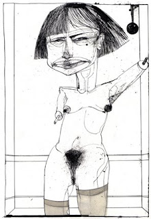
David Hughes - Illustrator


Came accross this chap whilst browsing some newspaper's weekend magazine, and had a look at his website.

I really like his illustration style, the media he uses and 'depth' of the images - each with their own meaning beyond their aethetics. His style reminds me of Ralph Steadman, who famously illustrated Hunter S. Thompsons Fear and Loathing in Las Vegas amongst others (if you like this style, take some time to look at 'Curse of Lono', another H.S.T. book that Steadman illustrated - the drawings are fantastic).

Websites rarely get me excited, but I liked Hughes' - pretty quirky.

Jean Tinguely - Sculptor


A Swiss Kinetic/Mechanical artist, his work being particularly abstract and surreal. A lot of it was a reaction against the overproduction of manufactured items in the increasingly industrialised society in which he lived. I'm particularly fond of the wit, charm, and irony of his objects, and the artistic and engineering wonder that they encompass.

Jean Dubuffet - French Artist


One of the more famous French artists of the last century, and a particular fan/pioneer of Art Brut or 'Ugly Art'. He believed that there was more truth in the unspoiled, creative art of the insane and amateur than the professional artist. His works include paintings, puppets and sculptures amongst others. I like his work.

Friday, 12 September 2008

John B - Mr Freud


Another piece of record artwork - this time taking the form of a die cut?? record sleeve to look like a floppy disk.  A simple idea well executed.  Huge similarities to New Order's Blue Monday record sleeve (bottom).

Critical Recordings Artwok


More artwork done for the same record label as below.  The latest 5 releases have taken this format, with the latest ones (not shown) in red and blue.  I really like the simplicity of the designs and their visual impact, with the colours on black, and the fact that with each of them, you know instantly which record label they 'come from' - a sort of identity.