Thursday, 2 October 2008
Radio 4 Reith Lectures
find them here
Russian Revolution Propoganda Posters


There's something about these images I have always loved - the colours, the slightly absurd content, the stylisation of them. The proliferation of these colourful images transformed towns in the communist state, and in effect created a street art that was available to all.
The big designers were:
A. Sokolov
B Lebeshev
Adolf Strakhov
Shassi Kobelev
V Malakhow
if you wanted to know...
El Lissitsky
David Hopkins - Dada and Surrealism
Dada and Surrealism


Dada is an artistic movement that began in Switzerland, but then spread across Europe primarily to Paris, and then to America due to some of the movements main 'players', Marcel Duchamp, Francis Picabia and Man Ray. Andre Breton is worth noting here, but he was arguably more influential in the Surrealist movement I think, as were the others to an extent.
Their activities covered many spectrums including the publication of journals, public gatherings and demonstrations, literature, film, graphic design, theatre and visual art. The funny thing is is that Dada is 'anti-art' art. It was a reaction to the bourgeois art world, they embraced chaos, they were reacting against the traditional aesthetics of art, they were intentionally 'opposite'. They looked to offend, and there is an underlying sense of wit and humour to their work.
It eventually evolved into Surrealism, but there are distinct differences between the two (books have been written on the subject, not enough space here...!). It was again a cultural movement that embraced art, film and the written word (La Revolution Surrealiste is of particular importance). Elements of surprise, juxtaposition and expression are apparent in their work, and I'm sure many of you are very familiar with a lot of the paintings and the artists involved in this movement.
There's so much on this subject to go and read, I find it really fascinating and the concepts behind a lot of the work is very applicable to anyones work today - it's an alternative way of looking at things. To sum up, Andre Breton once said whilst discussing Aesthetics,
"From a surrealist point of view, the way in which a picture is painted is virtually irrelevant. It is the mental reality that the picture 'looked onto' that is all important."
Images 1 - Rene Margritte, Time Transfixed
Image 2 - Joan Miro - Naked woman climing staircase
Images 3 & 4 - examples of Dada graphics
Image 5 - very funny. L.H.O.O.Q. when pronounced in French reads, 'She has a hot ass'...
Vienesse Actionism


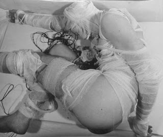
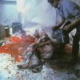
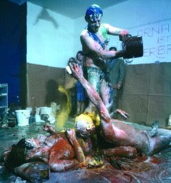
Having mentioned this so much, I may as well explain further. It was an art movement that belonged to a group of Austrians who grew up with the memory of WW2; their work was a reaction against the political oppresion and socail hypocrasy of their country at the time. The main participants were Gunter Brus (below), Otto Muhl, Hermann Nitsch and Rudolf Schwarzkogler.
They loved nakedness, violence, destruction and general degredation. Their work does differ visually, but there are distinct aesthetic and thematic trends between them. To explain this, Otto Muhl said, "...material action is painting that has spread beyond the picture surface. The human body, a laid table or a room becomes the picture surface. Time is added to the dimension of the body and space."
A strange bunch really...
(2nd image - Robert Schwarzkogler, 3rd image - Otto Muhl)
There's an intersting article about them here.
Gunter Brus


Gunter Brus was an Austrian performance artist, draughtsman, painter and film maker, and was born in 1938. With others he was a founder-member of the Aktionismus group (Viennese Actionism). Brus conceived of his Aktionen (action - call to art) in terms of paintings, where the body occupied the centre of a clearly defined space. Just as he had previously scratched and degraded the fabric of his paintings to the point of destruction whilst working in such a medium, in his Aktionen he portrayed various acts of self-mutilation.
In his Aktionen after 1967, Brus pushed himself to further physical and mental extremes as he analysed his own body and its functions. Symbolism was generally dispensed with in the performances, as Brus publicly urinated, defecated and cut himself with a razor-blade.
In his work entitled 'Self Paining', Brus covered his whole body in white paint, and then painted black lines over himself to suggest cracks. The collaged pins, razor blades and pen-knife take on the ritual significance of tools of torture, making Brus's body like that of a saint. By using his body in this way, Brus was trying to introduce raw human emotion into art (as opposed to symbolising it, as mentioned earlier). The collage is typical of the counter-culture which encompassed the Vienesse Actionists.
I think Brus himself sums up everything (if it's not already blatently obvious!!)
"Breaking taboos has almost become a style in my work."
Extreme stuff I'm sure you'll agree...
Robert Mapplethorpe


Diane Arbus


Another photographer people should know about, I find her choice of subjects particularly interesting - often people on the edge of society such as tramps/prostitutes etc (which was contrary to photographic convention at the time), things that 'don't quite fit'. One of her more well known images of two female twins famously inspired Stanley Kubrik in 'The Shining' - the resemblance is obvious. Also of note is the intrinsic dullness of the prints, which adds to the thought provoking content.
Jean - Luc Godard - Weekend


Wednesday, 1 October 2008
Pieter Hugo


Young South African photographer, tipped to be great. Have a look at his website, I particularly like his 'Hyene and other men' series - the interaction between man and beast is of note.
Erwin Blumenfeld


Erwin Blumenfeld is one of the most famous photographers of the 20th century, hailing from Berlin. My particular interest in him leads from his Dada and Surrealist influences. He definitely incorporates the visual language and techniques of these artistic movements. His interesting and experimental images often include processes such as collage, solarisation, multiple exposures and the combination of negative and positive printing. For instance in his work 'city lights', he uses simple props and stage effects to convey the almost fantastical aura of modern (in that day) day life.
Rineke Dijkstra
Nido Bird Food
Calvin Klein
Tuesday, 30 September 2008
World of Interiors
Keith Skeel


I'm not totally sure why I've included this in my 'blog', but I feel this gentleman worthy of note. The only way I can think of describing him is as an antique 'super-collector' and a purveyor of antiquarian eccentricities. Having started from humble beginnings as a small time seller of 'funny things' at Bermondsy market in London, he has become a serious collector with a passion for beautiful, gutsy, dramatic and amusing things, a highly acclaimed 'interior decorator's decorator', and has done work for Donna Karen, Versace and Ralph Lauren.
Julien LaChaussee - Photographer


Monday, 29 September 2008
Oliviero Toscani


An Italian photographer and art director, who trained at the Dada and Bauhaus influenced Zurich Design School (I believe you can particularly see the Dada influence in his work). He is notorious for his work with Benetton, with whom he abandoned any form of conventional advertising photography, and instead flouted taboos associated with race, war, sex, religion, death etc. The campaigns use juxtaposition as the main tool to create meaning by using socially unmentionable subjects to create awareness of different issues, and virtually all created some sort of public outcry.
The most infamous images included the dying David Kirby (of AIDS) and images of death-row prisoners, which due to the backlash from the victims families caused Benetton to lose a major contract, and Toscani to finish his tenure with the company.
At least his campaigns kept everyone talking about Benetton, and he dared show the unmentionables. What taboos are left...?
Nolita - Anti Anorexia Ad

Gay Police Association Advert (2006ish)

Thursday, 25 September 2008
Alain De Botton - The Architecture of Happiness

This book flooded me with joy when I read it the first time. Everything he talks about provokes more philosophical questions which he is sure to discuss as you read on. He answered so many questions I had about so many things - the content here is obviously centered around architecture, but the opinions and ruses can be applied to so many other aspects of design. Well worth reading.
Jonathan Root - Photographer


